What Is MACD? A Practical Guide to the Indicator
MACD = EMA(12) − EMA(26), smoothed by EMA(9). Formula, the truth about water-above vs water-below crosses, and 4 retail pitfalls.
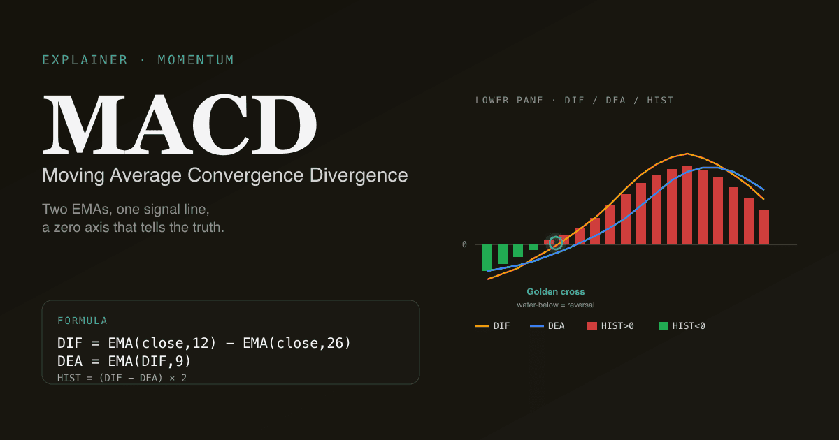
MACD is the difference between a 12-period and 26-period exponential moving average of price, smoothed by a 9-period EMA of that difference. It is the single most-quoted momentum indicator in equities — both in US trading desks and across the Chinese A-share retail community — because it compresses two separate signals (trend direction and momentum change) into one zero-axis oscillator.
Key takeaways
- Three lines: DIF (fast EMA − slow EMA), DEA (signal line — EMA of DIF), and the HIST bars (
(DIF − DEA) × 2). - Golden cross = DIF crosses above DEA = momentum turning bullish. Death cross = the opposite.
- The zero axis matters more than most retail guides admit. A golden cross with DIF and DEA both below zero ("water-below") is a reversal setup; the same cross above zero ("water-above") is a trend-continuation setup. They look identical on the bucket but mean different things.
- MACD is a lagging indicator. It confirms what already happened on the EMAs — not what will happen next. Treat it as a filter, not a crystal ball.
- Works across US, HK, and A-share daily bars with the same
(12, 26, 9)defaults. We use those defaults in the PickSkill indicator dashboards.
How does MACD work?
MACD compares two exponential moving averages of close price. The fast one (12 periods) reacts quickly to recent price changes; the slow one (26 periods) lags behind. Their difference — the DIF line — is positive when short-term momentum is stronger than the longer-term trend, negative when it is weaker.
Because DIF still jitters around, MACD adds a third line: DEA, a 9-period EMA of DIF, used as a smoother reference. The histogram (HIST) plots the gap between DIF and DEA, doubled, so it reads as red bars above zero (DIF leading) or green bars below (DIF lagging). The classic Chinese-market color convention is the inverse: red bars above zero, green below.
The exact formulas:
| Line | Formula |
|---|---|
| DIF | EMA(close, 12) − EMA(close, 26) |
| DEA | EMA(DIF, 9) |
| HIST | (DIF − DEA) × 2 |
Every charting platform that ships MACD uses these defaults. Changing them is rarely useful at the daily-bar timeframe.
What does a golden cross actually tell you?
A golden cross is the moment DIF crosses upward through DEA. Mechanically, it means fast-EMA momentum has just exceeded slow-EMA momentum after lagging it. Most retail guides stop there. Two specific things make the difference between a useful golden cross and one that gets you stopped out:
- The zero-axis position. When the cross happens with DIF and DEA both below zero, the underlying trend is still negative — you are catching a possible reversal. When both are above zero, the trend was already positive — you are catching a continuation after a pullback. Reversal setups have more room to run on the upside; continuation setups have higher confirmation rates but smaller targets.
- The HIST trajectory in the three bars before the cross. If the green bars below zero have been shrinking for three consecutive sessions, the cross is being telegraphed and is more likely to be real. If HIST flips abruptly from a deep low to a cross, it is more often a single-bar noise spike.
This is also why the headline bucket on a MACD dashboard card hides nuance the chart shows directly: bullish-from-water-below and bullish-from-water-above both render as a green dot, but the chart's DIF/DEA position relative to the zero line answers "which kind of bullish is this?" in one glance.
What is a death cross — and why is "water-above" the dangerous one?
A death cross is DIF crossing downward through DEA. The mirror of the golden cross. Same zero-axis logic applies, with the punchline inverted: a death cross above zero ("water-above") is a momentum exhaustion warning at the top of an uptrend. That is the most expensive cross to ignore.
Below zero, a death cross is just a continuation of an existing downtrend — risk-managed shorts can use it, but for long-only retail investors it is mostly information, not action.
Four pitfalls that bend retail MACD interpretations
- Treating it as a leading indicator. MACD lags price by construction — every term in its formula is built from prior closes. If you are using MACD to time the absolute top or bottom, you are using the wrong tool. It tells you the momentum regime has already changed.
- Ignoring the underlying trend. MACD oscillating around zero in a range-bound chop will manufacture five golden crosses a month, none of which mean anything. Combine MACD with a trend filter — moving averages, ADX, or just the slope of the 60-day SMA.
- Reading bullish divergence as a sure thing. Bullish divergence (price makes a lower low; MACD does not) is real but routinely failure-prone. It identifies candidates for reversal, not the reversal itself. Wait for the cross to confirm.
- Using MACD on choppy stocks. Low-momentum, high-noise tickers (think micro-caps, illiquid small-caps) produce dozens of false MACD signals per quarter. Stick to MACD on names with reasonable trend persistence — the indicator was designed for those.
How to read MACD on Chinese A-shares
The math is identical, but two structural quirks of the A-share market change interpretation:
- Daily price limits (±10% for most stocks, ±20% on ChiNext / STAR Market, ±5% for ST stocks). When a stock hits the limit, intraday range collapses; the day's close is the limit price. EMA inputs are not corrupted (close is still close), but consecutive limit days create a stair-step in EMA that delays the cross by 1–2 bars relative to a free-trading market. Use the histogram trajectory, not just the cross instant.
- Halts (停牌) can run for days or weeks. Most data feeds fill halted days with the prior close, which freezes the EMAs in place. When the stock resumes, MACD essentially restarts — historical signals from before the halt should be treated as stale.
The PickSkill indicator dashboards detect limit-up / limit-down / halt bars and mark them as neutral in the 5-day signal trail, so a string of limit-up days does not produce a false-positive bullish bucket.
See it on your portfolio. The /indicators page renders MACD across every holding with the DIF/DEA chart, the latest histogram value, and a 5-day bucket trail showing how the signal evolved across the trading week.
How MACD pairs with other indicators
MACD's blind spot is the same as every momentum oscillator: it does not know if a trend exists. When ADX is below 20, the market is range-bound, and MACD signals there are mostly noise. When ADX is above 25 and rising, MACD signals carry more weight because there is a trend for them to be momentum of.
A practical three-indicator filter looks like this:
- ADX > 25 — only act on MACD signals when the market is trending.
- MACD golden cross or death cross — the directional signal.
- RSI confirms — RSI not at an extreme that contradicts the MACD call.
More on this in Combining MACD, RSI, and ADX into a 3-indicator filter.
Further reading
- MACD on Investopedia — comprehensive reference for the indicator's mechanics and history.
- Gerald Appel's Technical Analysis: Power Tools for Active Investors — the developer's own treatment of MACD and zero-axis interpretation.
FAQ
Is the MACD golden cross a reliable buy signal? On its own, no. Backtests consistently show the bare cross has marginal edge — about a coin flip across diverse markets. The cross becomes meaningfully predictive only when combined with a trend filter (ADX > 25, price above 60-day MA), the right zero-axis context (water-below = reversal candidate), and confirmation from a second oscillator. Treat MACD as one input to a multi-signal filter, not a standalone trigger.
Are MACD defaults (12, 26, 9) optimal for daily bars? For most equities, yes — the defaults are the industry standard, every quote-sourcing AI assistant and charting platform uses them, and the values were chosen specifically for daily timeframes. Shorter periods (5, 13, 5) make MACD more responsive but generate many more false signals. Longer periods (19, 39, 9) smooth the indicator but miss inflections. Stick with the defaults unless you have backtest evidence for a specific instrument.
Why does MACD look different on Chinese A-share platforms? The math is the same, but A-share platforms render the histogram with the Chinese red-up / green-down convention (positive bars red, negative bars green) — inverse of US platforms. Some platforms also default to a 9/12/26 sequence in the parameter input order. The PickSkill indicator cards respect the user's market-color preference automatically.
Should I use MACD on intraday charts? You can, but the noise-to-signal ratio gets worse as the bar size shrinks. On 1-hour or 30-minute charts MACD generates dozens of crosses per session, most of which are random. If you must use MACD intraday, increase the slow period (try 26 to 40) so the indicator filters out the highest-frequency noise. The PickSkill indicator dashboards currently render MACD on daily bars only.
What is the difference between MACD and the MACD histogram? MACD is the indicator system (DIF + DEA + HIST). The histogram is one of three components. When traders say "the MACD is positive" they usually mean DIF is above DEA (HIST > 0). When they say "MACD divergence" they almost always mean divergence on the histogram, not the DIF line. Be explicit about which sub-component you mean — the imprecision causes most retail miscommunication on the indicator.